Color
The Color section allows you to customize various color settings for your site to match your brand and design preferences. Use the color pick fields to adjust the appearance of different elements, ensuring a cohesive and visually appealing user experience.
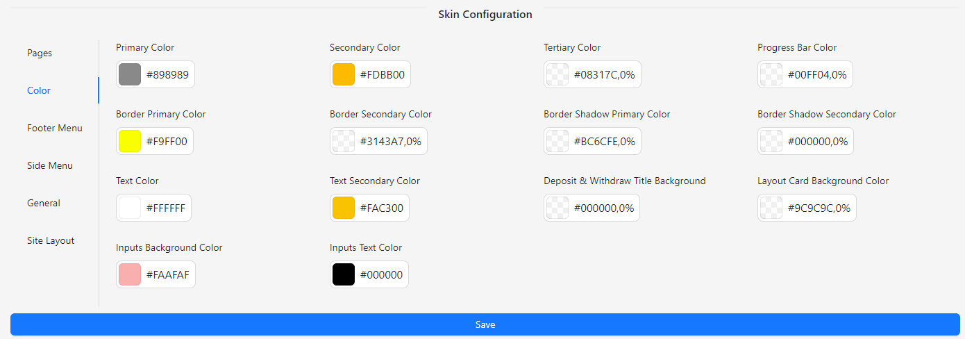
- Primary Color: Select the main color for your site’s primary elements.
- Secondary Color: Choose the color for secondary elements that complement the primary color.
- Tertiary Color: Define the color for tertiary elements to add variety and depth.
- Progress Bar Color: Set the color for progress bars to enhance visual feedback.
- Border Primary Color: Choose the color for primary borders throughout the site.
- Border Secondary Color: Define the color for secondary borders to differentiate elements.
- Border Shadow Primary Color: Set the color for primary border shadows to add depth.
- Border Shadow Secondary Color: Choose the color for secondary border shadows for subtle effects.
- Text Color: Select the color for main text to ensure readability.
- Text Secondary Color: Define the color for secondary text to provide contrast and emphasis.
- Deposit & Withdraw Title Background: Choose the background color for deposit and withdraw section titles.
- Layout Card Background Color: Set the background color for layout cards to enhance the design.
- Inputs Background Color: Define the background color for input fields to ensure clarity and consistency.
- Inputs Text Color: Select the color for text within input fields for readability and accessibility.